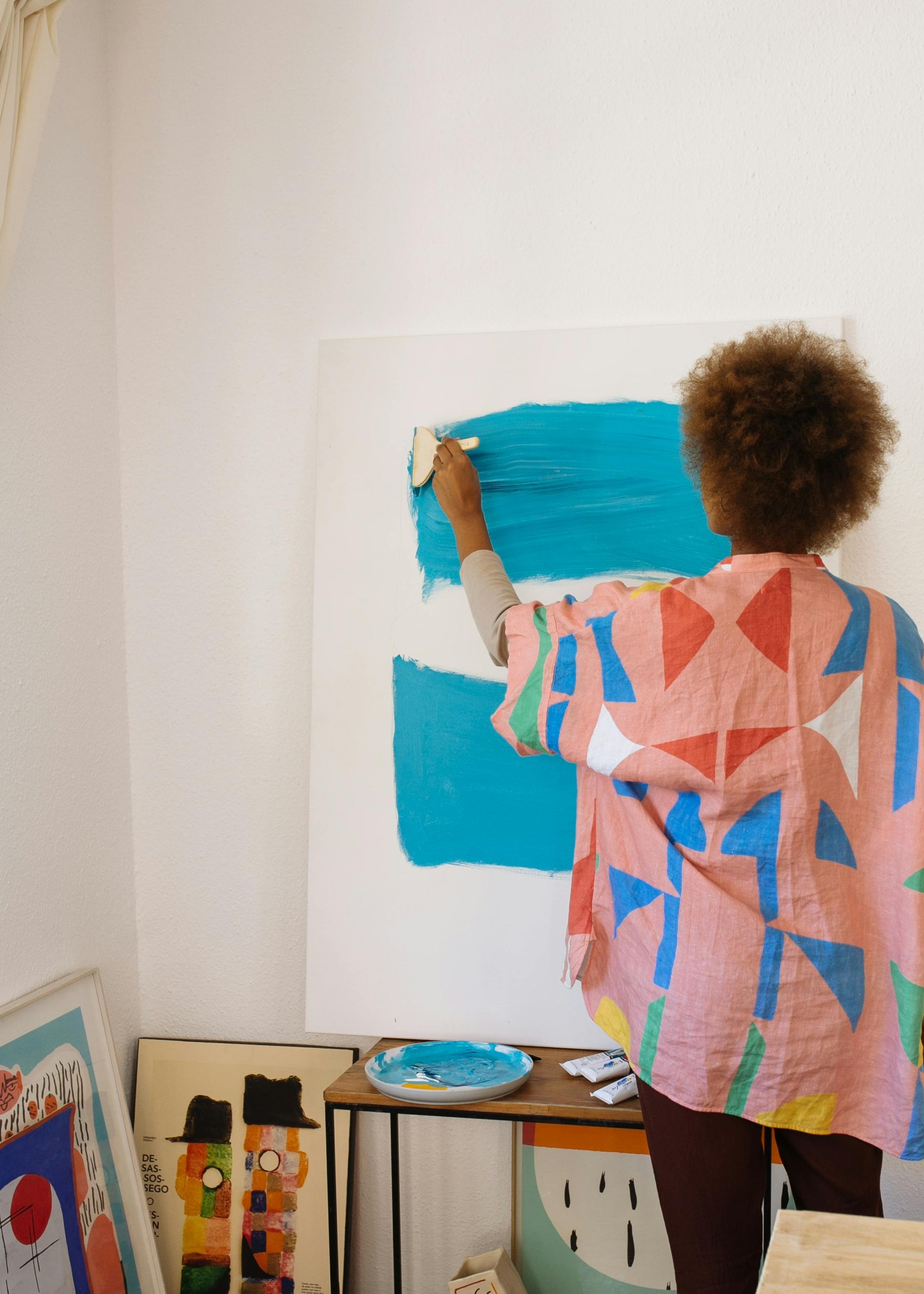
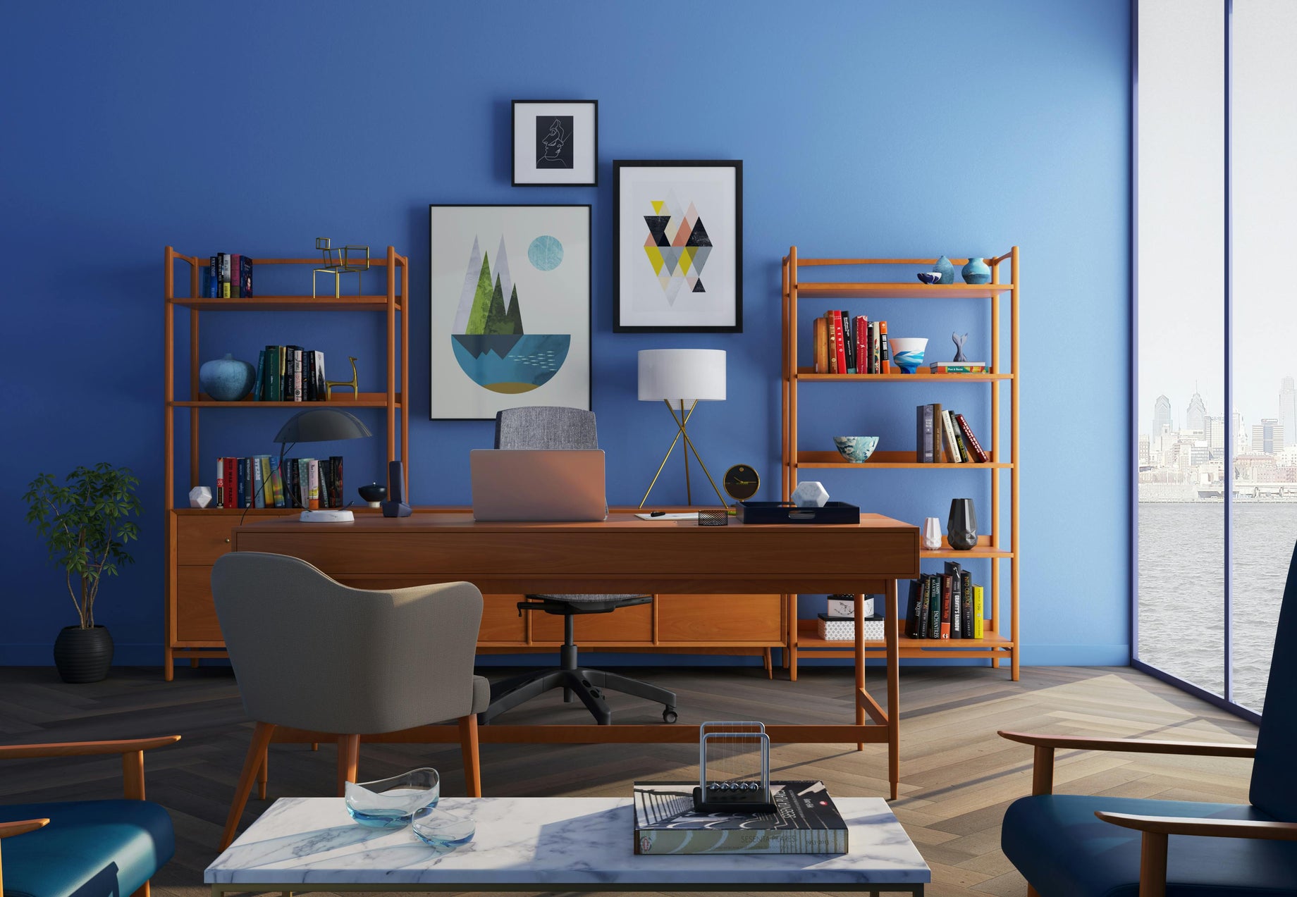
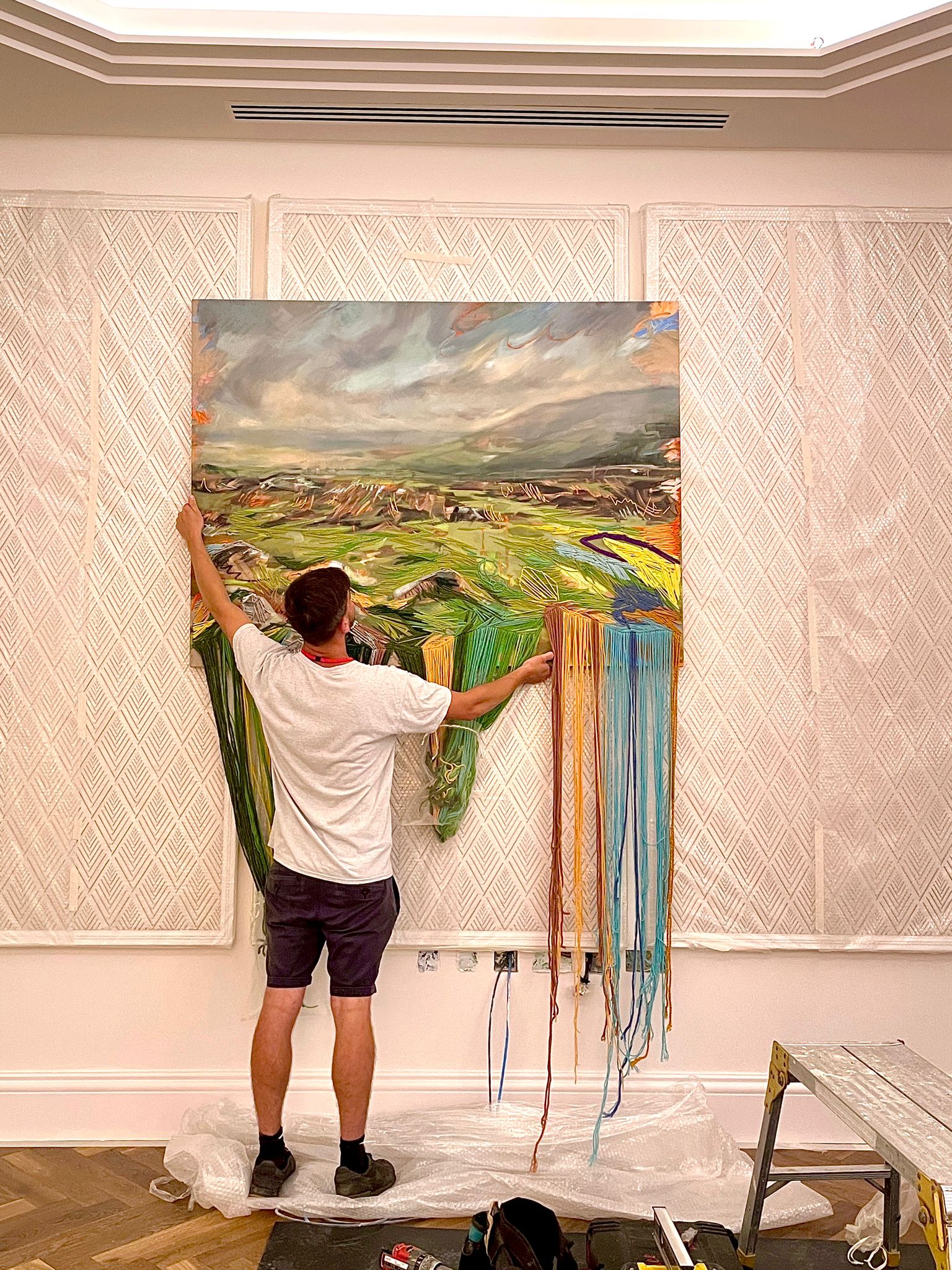
Have you ever struggled to choose the right art for your workspace? When it comes to curating art for your offices and workspaces, oftentimes the logical approach will be prioritised over the emotional. But how often do we find ourselves feeling overwhelmed in our work environment and wishing we could take a mini brain break for a minute or two? At work, our emotions are at an all time high, with feelings of stress, excitement, boredom, gratitude… the list goes on! So wouldn’t it be nice if these feelings were mediated by a profound art piece? A work of art that evokes a sense of energy or calm, bringing added comfort to your day? It’s important to see how art contributes to our work environment, especially when it comes to our mood and work productivity. At Curaty, this is our curatorial USP, and we’ve noticed a pattern in common mistakes people make when deciding on a piece to add to their collections.
Here are 6 common mistakes we’ve noticed that you might be making:
1. ️ Ignoring the purpose: Your workspace art should align with the atmosphere you're aiming to create and the values of your organisation. Afterall, art is a powerful placemaking tool! You want to consider whether the usage of the space is for inspiration, relaxation, or focus. We find that choosing art that resonates with your workspace ethos is always a good way to go! It will make your workspace feel more authentic and inspiring which ultimately drives success in work productivity. Having art thats too flashy or too dull can cause distraction rather than observation, be depressive instead of inspiring, and we definitely know which direction we're leaning towards when we're at work.
2️. Not considering the layout: Art placement is important in a workspace. It’s good to make sure the piece complements the layout of your workspace and doesn't obstruct the functionality and spacing. Art that is too small can get lost in a large space unless strategically placed as a focus spot, while oversized pieces can overwhelm smaller areas and feel obstructive. Consider the height at which wall works are placed, you never want something that a chair might run into! Also, an artwork hung high can feel overwhelming, whilst a lower hang can feel informal, conversational and loungy. What impact do you want to achieve with your workspace artwork?
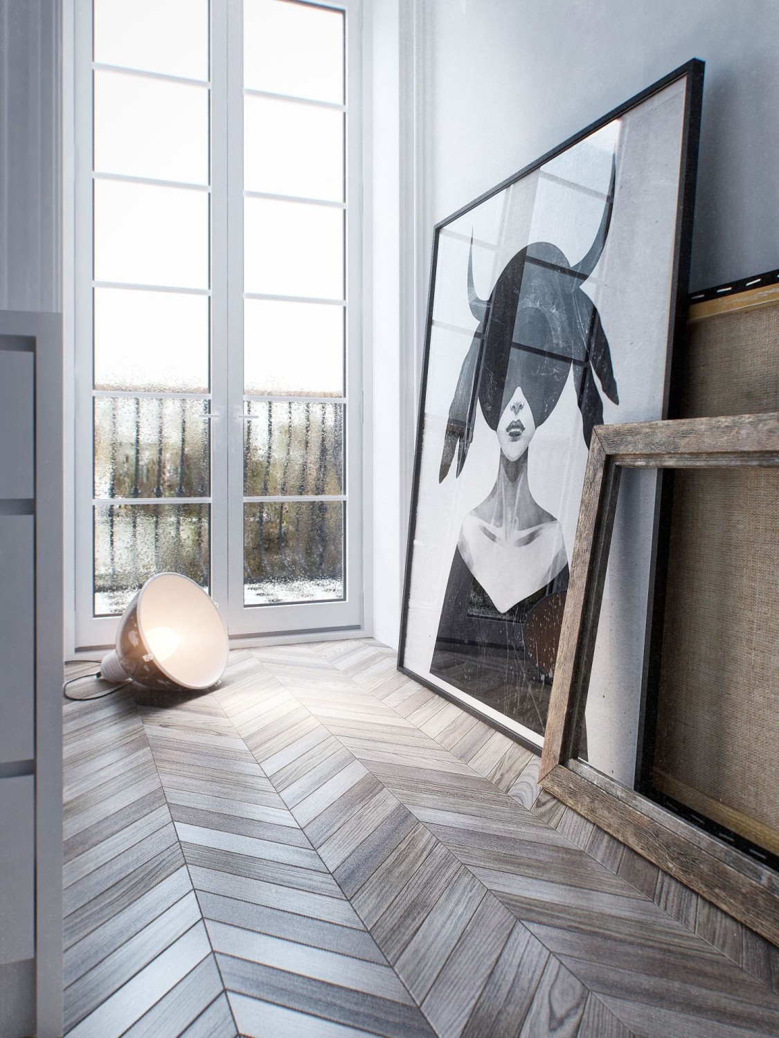
3️. Neglecting colour psychology: In art, different colours can evoke different emotions. You want to choose palettes that promote productivity as well as creativity in your workspace. Choosing jarring colours for spaces meant for focus is a no no! But, bright colours in a space meant to energise and foster collaboration can be transformative.
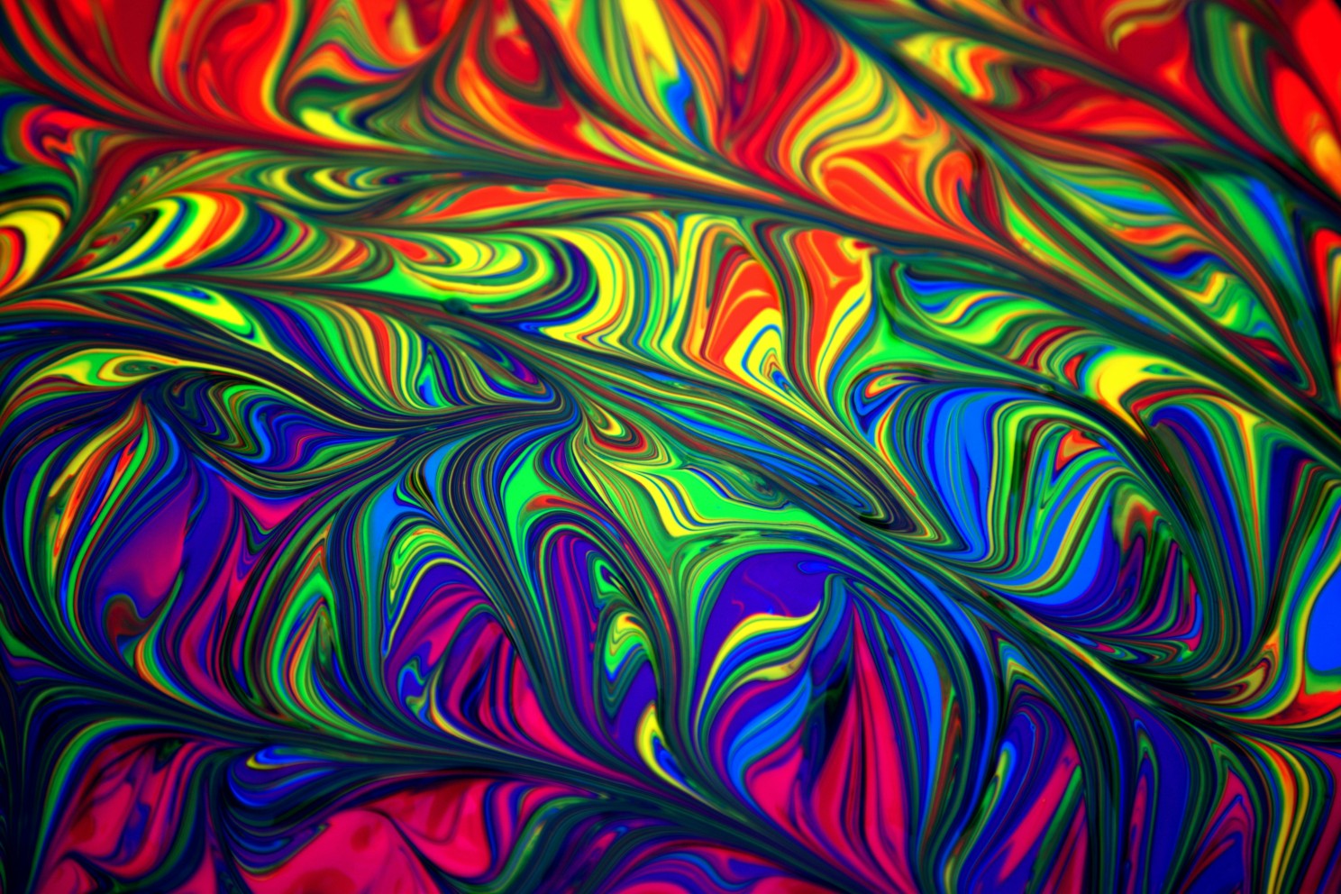
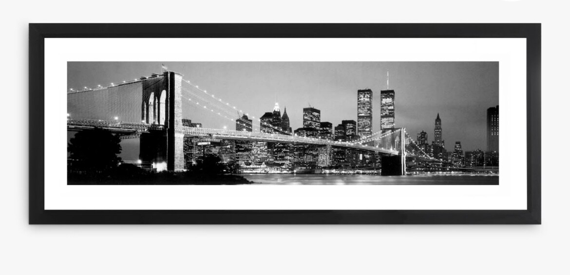
4. Being too trendy: While trendy art can be eye-catching, you may find it becomes outdated quickly. Take cityscapes and Bansky art for example, all workspaces seem to love a skyline and a red heart balloon… we suggest you opt for unique and timeless pieces that will stand the test of time and give the same awe as something that's trendy. You want your workspace art to reflect both your brand identity and the image you want to convey to clients and colleagues, how do these pieces communicate your brand?
5️. Ignoring lighting: Choosing a stellar art piece but forgetting about lighting, in any space can make or break the impact of the artwork in the space. Bad lighting such as a small awkward spotlight for a large painting, or hue that's too yellow can ruin the overall look of your piece. A good tip is to ensure that your artwork is well-lit or in an area that has the most exposure to indirect natural light (never direct sunlight which can cause irreversible damage to artworks!) to enhance its impact. If this isn’t possible try finding an artificial lighting solution of CRI 90+ to create the same effect! Look for LEDs that are labeled "full spectrum" or have a colour temperature within the range of 2700K (warm white) to 6500K (daylight). We tend not to recommend non-LED lights as they're less environmentally sustainable and produce excess heat which can damage artworks in the long run. We recommend clients invest in a track lighting system across workspaces as it supports flexibility for the evolution of your workspace over time e.g. changing/rotate the artworks on display, and movement of desks etc as the space usage changes.
6. Overlooking maintenance: You want to consider the type of upkeep your artwork would require. We often come across corporate offices with great works of art placed in frames that that are not acid free or with glass that has no UV protection placed directly in natural light, this can discolour and irreversibly damage the artwork over time, and is a big no no! Another classic mistake is placing materially sensitive artworks in environments that have constantly changing temperatures. Switching of the heating and cooling based on usage can lead to mould, dampening or even buckling of canvases, and other temperature sensitive materials! This has the potential to not only affect the artwork but also the well-being of employees, as mould can be difficult to catch unless artwork conditions are monitored frequently.
Avoid these common mistakes and you can ensure that the art in your workspace enhances productivity, creativity, and overall well-being. Say no to second-thought art and enjoy the transformative creations of carefully produced art curation. We celebrate and encourage including profound artworks into your workspace and hope that these tips encourage you to do the same!
Perhaps you're a workspace operator, provider or designer and may feel a little called out by this article. Would it be helpful to know if you've made the right artwork decisions? Our curators would love to add value, advise and help dispel any fears and worries, drop us a line at info@curaty.co to schedule a call.
If you've found this newsletter helpful, do share the knowledge onwards. Together, let's spread the light and create a world where everyone, everyday can experience the profound power of art (our mission)!
We'd love to hear from you, so share your thoughts, questions and awakenings in the comments below! #WorkspaceArt #Curaty #OfficeDecor #NoNakedWalls #WeChampionArtists #InteriorDesign


